
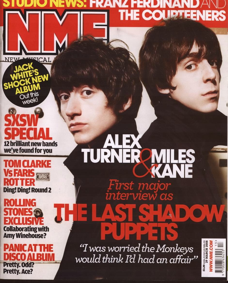


The first thing someone notices about the front cover is the background image, this image should be large and contrast the text that is put on top of it, this is what draws the readers eye to the product in the first place.
With the model or artist who is being photographed, the eyes must always be looking down the lens of the camera as if they are looking at the reader, this engages the reader further and creates a connection between product and target audience.
Nearly all the photos that are used for the background image are medium close ups. only a few differ from this.
In my opinion the Alex Turner and Miles Kane, NME magazine front cover is very good it uses various conventions such as a contrasting masthead, easy to read coverlines, a large image, headline text that contrasts the image behind it. It has a clear house style (red, white, and black)
On the other hand, The Tinie Tempah, Q, magazine is a poor example in my opinion, the coverlines (names) are hard to read down the side of the page, the headline text also doesn't contrast the image behind it very well.
No comments:
Post a Comment