Thursday 28 November 2013

A few examples of possible mastheads


Brand Identity for my music magazine
I want my music magazine to attract the attention of a certain section of the British population, introducing these people to new music and getting them to go and experience music themselves. That may be through themselves going to gigs or picking up an instrument and begging to learn how to play it.
My target audience based on feedback and investigation by myself will be students ranging from 16 up to 26, as I think between these ages people are more likely to pick up an instrument or go to gigs and generally be more music involved. For example students doing GCSE’s, A-levels or even at university wanting to have a good time, experience new artists or music.
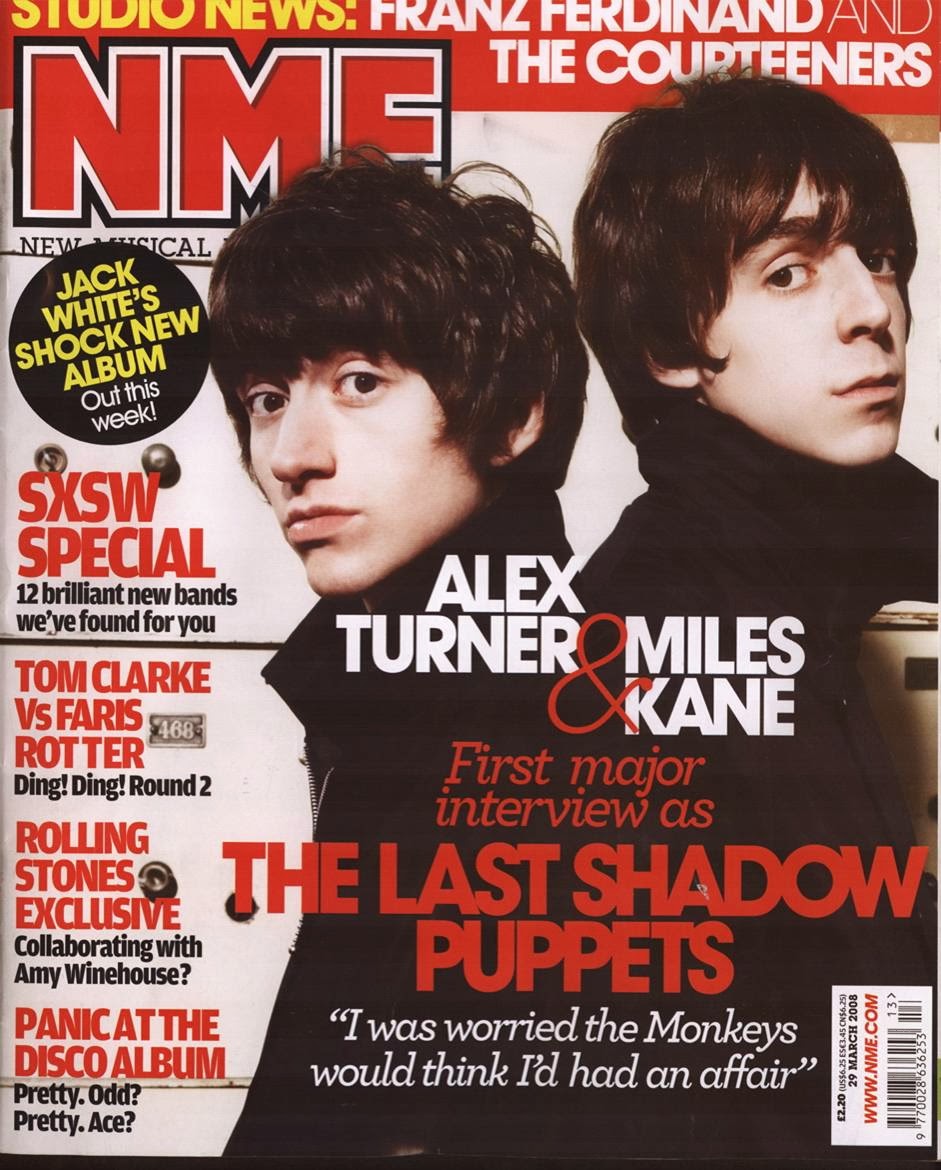
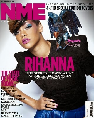
My magazine will have a minimalist theme as my questionnaire showed people would like this style, this is so it will be easy to read and the audience won’t be bored but information they don’t care about, I want to bring the most interesting news on some of the biggest artists but also insights in to how new and up-coming bands are progressing, I also want to be on top of major music news being one of the first magazines to have ‘breaking news’ but also information that other magazines do not show, so my audience gets ‘behind closed doors’ information.
I plan to write about more about bands rather than mainstream RnB music, unless a big news story in music has risen. I also want to include information on house music, major hip-hop names, some folk, rap and even drum and bass artists. This way I have a broad spectrum of genres included in my music magazine to draw a wide variety of people to read my magazine.

Wednesday 20 November 2013

NME Brand Identity


NME’s logo is the identity of the magazine the masthead is something that grabs the reader’s attention.
NME stands for New Music Express, from the name we can immediately see that NME focuses on bringing new music, and new artists to the public Another main selling point of NME is also live events, promoting new artists playing live gigs, and getting people interested in new music this way, they use competitions and chances to win gig tickets away to their readers though advertisement such as ‘Intimate sessions’ NME brings the newest but also the biggest indie, and rock and roll bands to the attention of the public, giving them, what they claim to be the most ‘truthful’ information a magazine has to offer. NME’s main story and image on the front of a magazine they produce is always of a better known commercial band in rock and roll, although they have had more mainstream commercial artists that are not indie or rock and instead are solo artists that are well known for a different music genre. Stars such as Jay-Z, Rihanna, Eminem, Chase and status, Lily Allen, and Florence and the machine have all featured on the front cover of NME. This again shows that they present commercial, better known artists that are associated with different music genres such as rap, and RnB amongst others.


NME are also very proud of their heritage and the fact that they have been producing magazines weekly for over 60 years. This is often mentioned somewhere in the magazine and is also mentioned in their about us page on their website. Even after 60 years NME still aim to get the attention of a younger audience by using certain characteristics in their magazine, such as competitions, certain advertisement, Font style, and the minimalist approach (which was changed to during 2010 under new editing management.) Also the language they use is important as it is less formal than other magazines this will appeal to a younger audience.

Monday 18 November 2013

Prezi research in to NME

http://prezi.com/lt8pfut3iqvr/detailed-analysis-and-textual-reading-of-a-music-magazine/

Sunday 3 November 2013

Conventions of a Contents page

Key conventions:


  • Bold text for the title contents
  • Main Focal Image something that draws the audiences eye to a particular story
  • Page Numbers are not in chronilogical order
  • House style this means that text, the color scheme, and any content in the magazine stays a specific way
  • The Layout should be structured and well designed, it should flow clearly. It would have been created using grids and guidlines that are followed to allow correct structure.
  • Columns used to order text and stories.
  • Blurb of contents this shows the main story/ stories, images and coverline information.
  • Subscription Pug/ Starburst giving information to the reader on how they can regularly get the magazine by subscribing.  


Examples of Magazine Front Covers


The first thing someone notices about the front cover is the background image, this image should be large and contrast the text that is put on top of it, this is what draws the readers eye to the product in the first place.

With the model or artist who is being photographed, the eyes must always be looking down the lens of the camera as if they are looking at the reader, this engages the reader further  and creates a connection between product and target audience.

Nearly all the photos that are used for the background image are medium close ups. only a few differ from this.

In my opinion the Alex Turner and Miles Kane, NME magazine front cover is very good it uses various conventions such as a contrasting masthead, easy to read coverlines, a large image, headline text that contrasts the image behind it. It has a clear house style (red, white, and black)

On the other hand, The Tinie Tempah, Q, magazine is a poor example in my opinion, the coverlines (names) are hard to read down the side of the page, the headline text also doesn't contrast the image behind it very well.

Draft/ 1st attempt for a front cover

This is my 1st attempt and rough draft of a magazine front cover, to make this i used adobe fireworks, i have used contrasting colors that stand out and different text sizes for certain text so that certain titles, coverlines or stories stand out on the page more.
For most of the colors used i have stuck to the house color of the school, red, black, white and white.